The #BetterPoster: a research poster that works like a billboard
Most conference posters are walls of text. Nobody reads them. People walk past, glance, and move on, and the presenter ends up reading their own poster out loud to whoever stops.
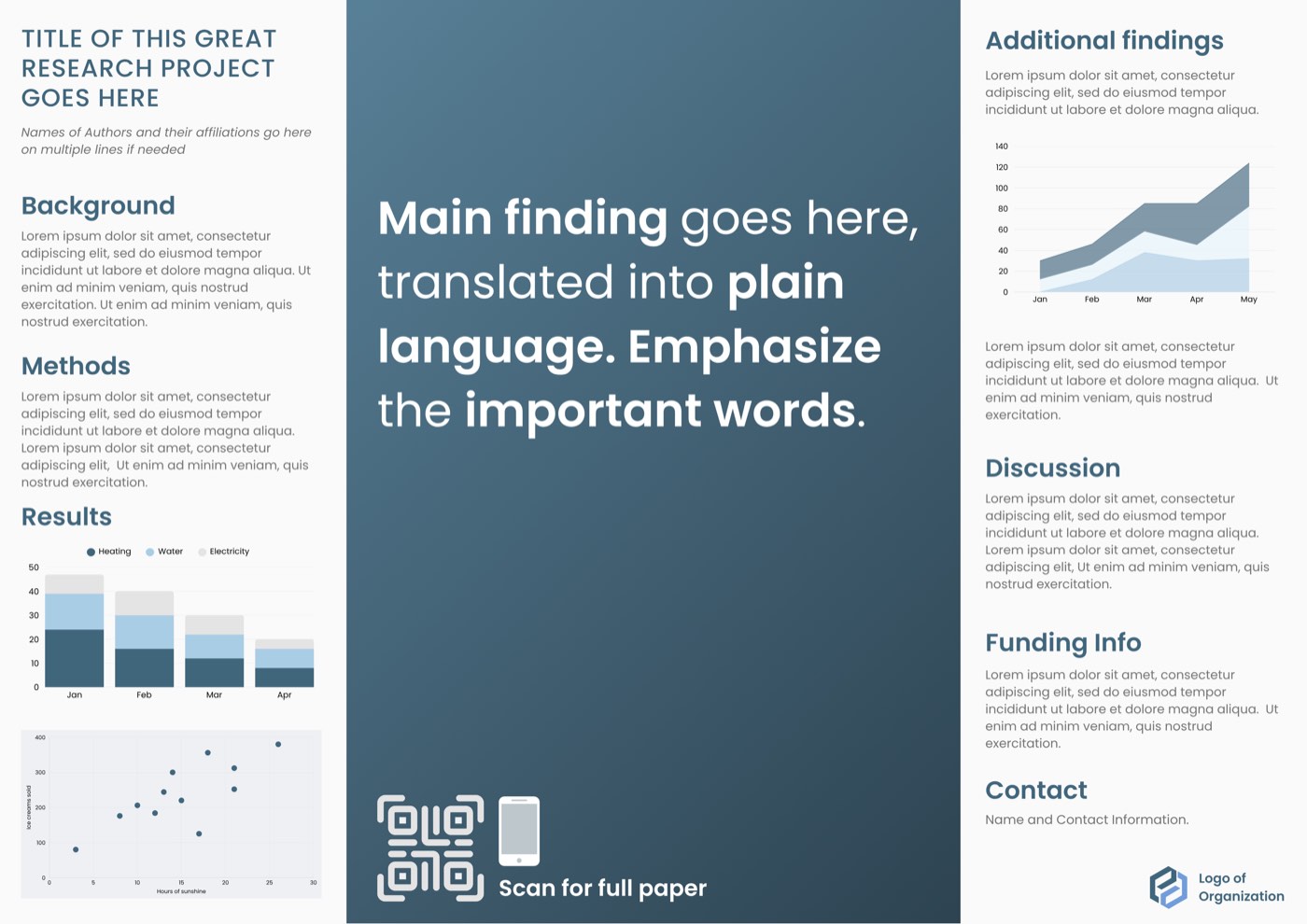
The #betterposter fixes that by borrowing from advertising. It treats the poster like a billboard: one big finding, readable from across the room, with the details tucked away behind a QR code for anyone who wants them.
It was created in 2019 by Mike Morrison, then a psychology PhD student at Michigan State University. His first video on it went viral among researchers, and the format has since been adopted as the standard poster layout by some conferences. He later wrote it up with colleagues in Cell: How to Boost the Impact of Scientific Conferences. His original walkthrough is here: How to create a better research poster in less time.
The classic poster vs the #betterposter
| Feature | Classic poster | #Betterposter |
|---|---|---|
| Title | A topic: "Sleep deprivation and memory in mice" | A finding: "One night without sleep wipes out new memories in mice" |
| Main finding | Buried in the Results section | Huge type in the centre of the poster |
| Word count | 800 to 1,200 words | Under 500 words |
| Reading time | Several minutes, standing close | About 30 seconds, from 10 feet away |
| Details | Everything is printed on the poster | A QR code links to the full paper |
| The presenter | Reads the poster to visitors | Talks while the poster speaks for itself |
The point is not that details do not matter. It is that the poster is not where they belong. The poster gets someone to stop. The conversation and the paper do the rest.
What goes on a #betterposter
The poster carries four kinds of content. The original layout puts them in a centre panel with two sidebars, but not every template works that way, so what matters is the content, not the placement.
The centre statement. One sentence, in the largest type on the poster, on a solid-colour background. This is the billboard. Someone walking past should get your finding without stopping.
The short version of the study (the silent presenter). A few bullets: what you asked, how you tested it, what you found. This is the part of a classic poster that survives, cut down hard. It speaks for you when you step away.
The figures (the ammo bar). One or two figures, the ones you actually point at when someone asks a question. A flow diagram belongs here too: if your study is a trial, a CONSORT flow diagram shows how participants moved through it; if it is a systematic review, a PRISMA flow diagram shows how studies were selected.
A QR code. It links to the full paper, a preprint, or a PDF of a longer poster. Put it under the centre statement, big enough to scan from a step back, and test it with a phone before you print.
How to make one
1. Find your one takeaway. If you had ten seconds to tell a colleague what you found, what would you say? That is your poster. Everything else is supporting material.
2. Write the statement. See the next section. This is the hardest step and the one that matters most. Do it before you open any design software.
3. Cut the rest to under 500 words. Write the short version as bullets: the question, the method in one or two lines, the result in one or two lines. If a sentence does not help a stranger understand the statement, delete it.
4. Pick one or two figures. The figure that proves the statement is the one to include. A second one earns its place only if it answers the question people always ask you. Charts beat tables here: nobody reads a table from ten feet away.
5. Lay it out. Statement in the centre, biggest type on the page, with generous white space around it. One background colour for the centre, so the eye lands there first. Keep the same fonts and colours as the rest of your work.
6. Add the QR code and test it. Link it to the paper or preprint, not to your homepage. Then stand ten feet back from your screen. If you cannot read the statement and understand the finding in about thirty seconds, it is not done yet.
How to write a good statement
A good statement is a finding, not a topic. "Sleep deprivation impairs memory" is a finding. "Sleep and memory" is a topic, and it tells nobody anything.
- One sentence. If it needs a second sentence, it is two findings. Pick the stronger one.
- Plain words, no jargon. Write it the way you would say it to a smart friend outside your field. No abbreviations, no acronyms, no field-specific shorthand.
- Put the result first, with a number if it helps. "A 20-minute walk cut cravings by a third" is stronger than "Walking may reduce cravings." Numbers make a claim concrete and memorable.
- Bold the words that matter. Morrison's own tip: emphasize the key words in the statement so a scanning eye catches them first.
- Test it on a stranger. Read it to someone outside your field. If they cannot repeat it back in their own words, rewrite it until they can.
Weak vs strong:
- Weak: "An investigation into the effects of a mindfulness intervention on stress in nurses."
- Strong: "Eight weeks of mindfulness cut nurses' stress scores by 25%."
- Weak: "Novel approaches to improving adherence in hypertension management."
- Strong: "Text reminders doubled the number of patients taking their blood pressure medication."
The strong versions are not dumbing the research down. They are saying what happened, in words a passer-by can keep.
When not to use it
The format is not right for every poster, and saying so is part of using it well.
- Your conference requires a set template. Some conferences and departments mandate a layout. Follow their rules; a rejected poster helps nobody.
- Your finding cannot be stated honestly in one sentence. If the honest version needs a qualifier, keep the qualifier. A punchy statement that overclaims is worse than a careful one.
- Your audience needs the methods on the poster. Some fields and some reviewers expect the full method printed. If your poster session is effectively a peer review, a classic layout may serve you better.
- You have nothing to link the QR code to. Without a paper, preprint, or longer PDF behind the code, the details have nowhere to live. Publish something first, or use a classic poster.
When in doubt, ask what the session is for. If it is for starting conversations with people outside your subfield, the billboard style wins. If it is for defending methods to specialists, the classic poster earns its word count.
Make yours with a template
My poster templates are built for this style: a big plain-language finding up top, room for one or two figures, and space for the details that belong on the poster. They are editable in PowerPoint and Canva with a free Canva account. Shop poster templates (opens in a new tab)
Want the whole poster done for you? Send your content, figures, and deadline to hello@xingbrew.ca, and I will turn them into a print-ready poster.